IBM CLIdesdale
Role: UX researcher. Project carried out at IBM Design Studios in Austin, TX.
SOLUTION STATEMENT
PROBLEM STATEMENT
To create a bridge that allows the UI and CLI to complement each other seamlessly.
To enable a busy DevOps Engineer, to automate repetitive tasks to scale out their cloud through a CLI/UI experience.
THE TOOLS
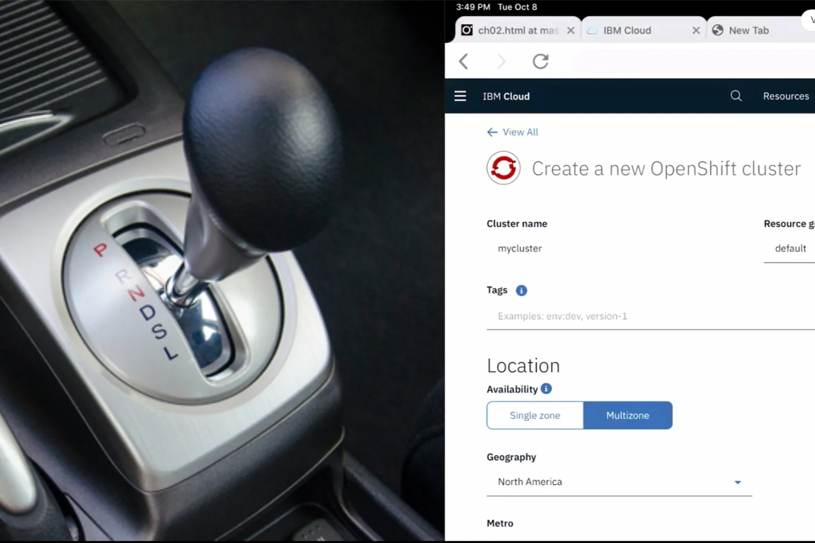
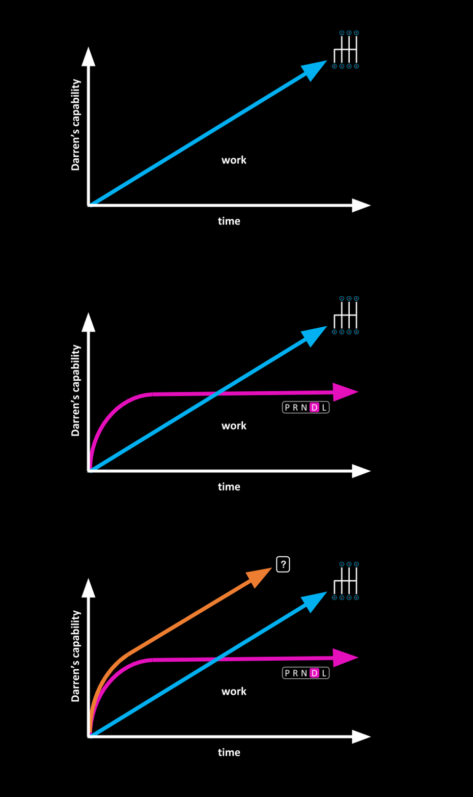
The Command Line Interface is like a manual transmission.
The positives:
power
control
efficiency
The negatives:
hard to learn
The User Interface is like an automatic transmission.
The positives:
intuitive
easy to use
easy to learn
The negatives:
little control
little efficiency
little power
PAIN POINTS
We found that as the UI allowed few technical tasks within Kubernetes, most DevOps used the CLI for all tasks despite its lack of intuitiveness. They encountered these pain points.
Having to go on an expedition to find parameters.
CLI commands are hard to learn.
Misusing tools for specific tasks.
How could we find a solution that would allow the CLI’s work capacity with the UI’s learning curve?
SOLUTION
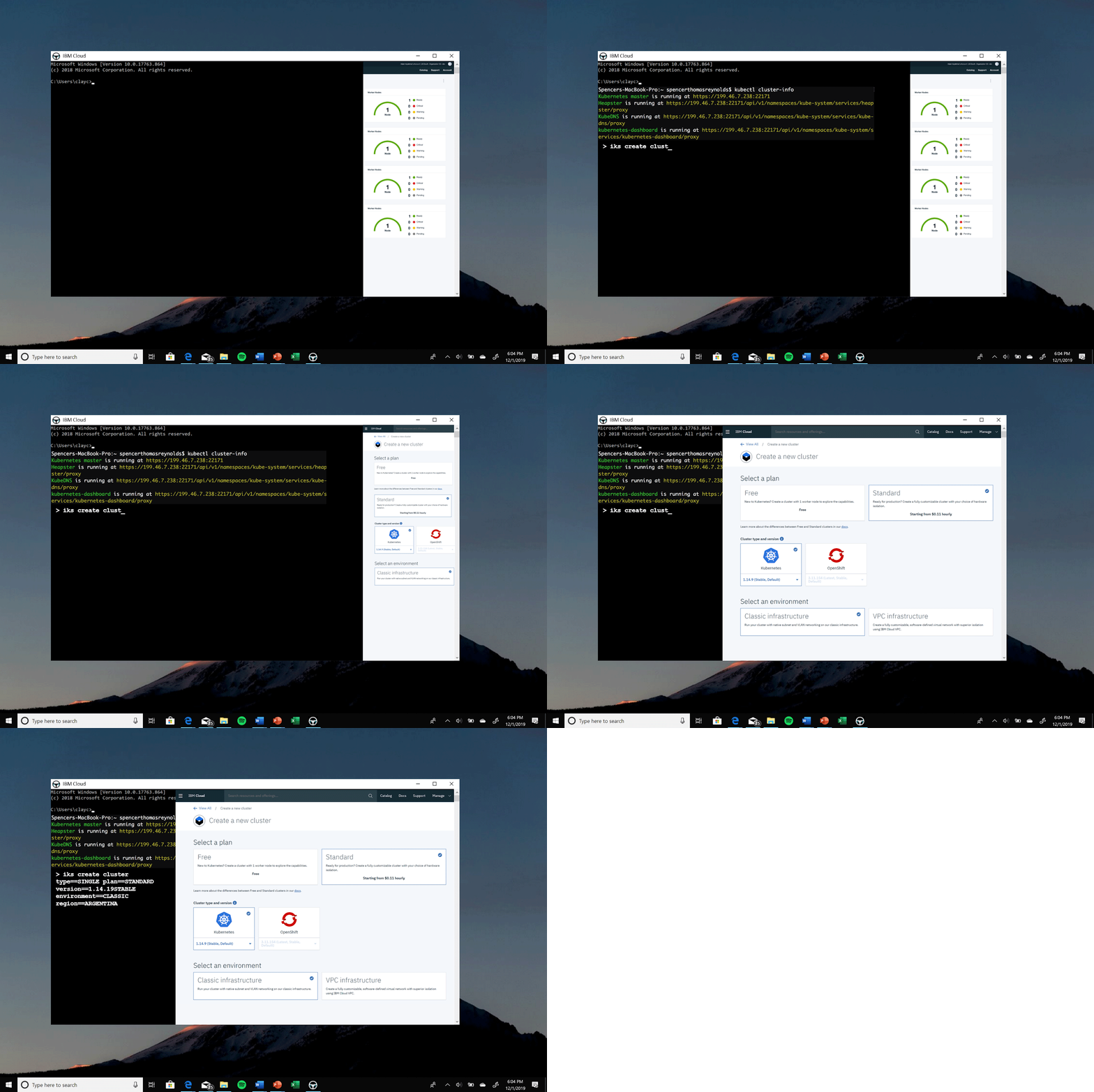
COMPLEMENTS
Aligns workflow of both interfaces;
Reinforces Darren’s understanding of abstract IKS concepts, making them easier to learn
ALIGNS
Allows two siloed interfaces to complement each other’s strengths;
Enhances Darren’s workflow by providing vital information on the complementary interface
ASSISTS
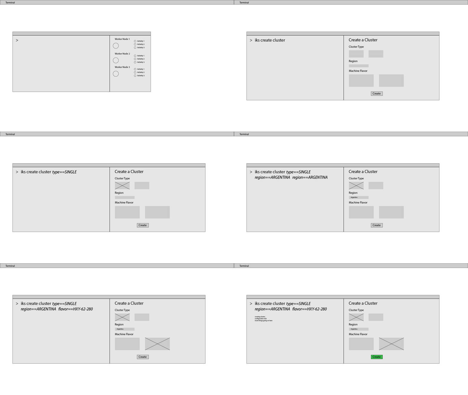
Assisted Development Environment (ADE) that guides user through a task, while giving them flexibility to use their preferred tools;
Guides Darren through workflow, suggesting him to use the most efficient interface
PROCESS
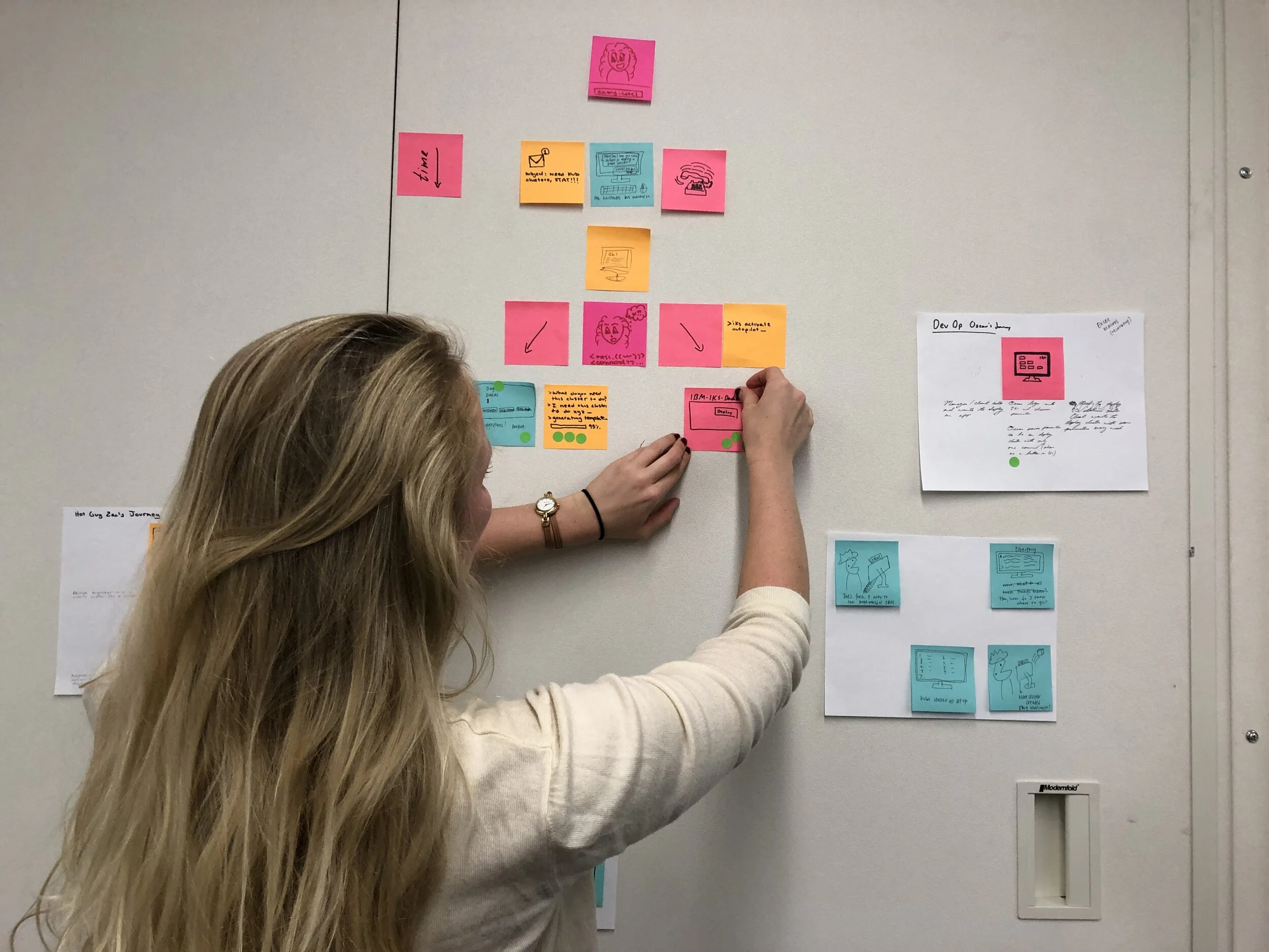
SENSE MAKING AND BIG IDEAS
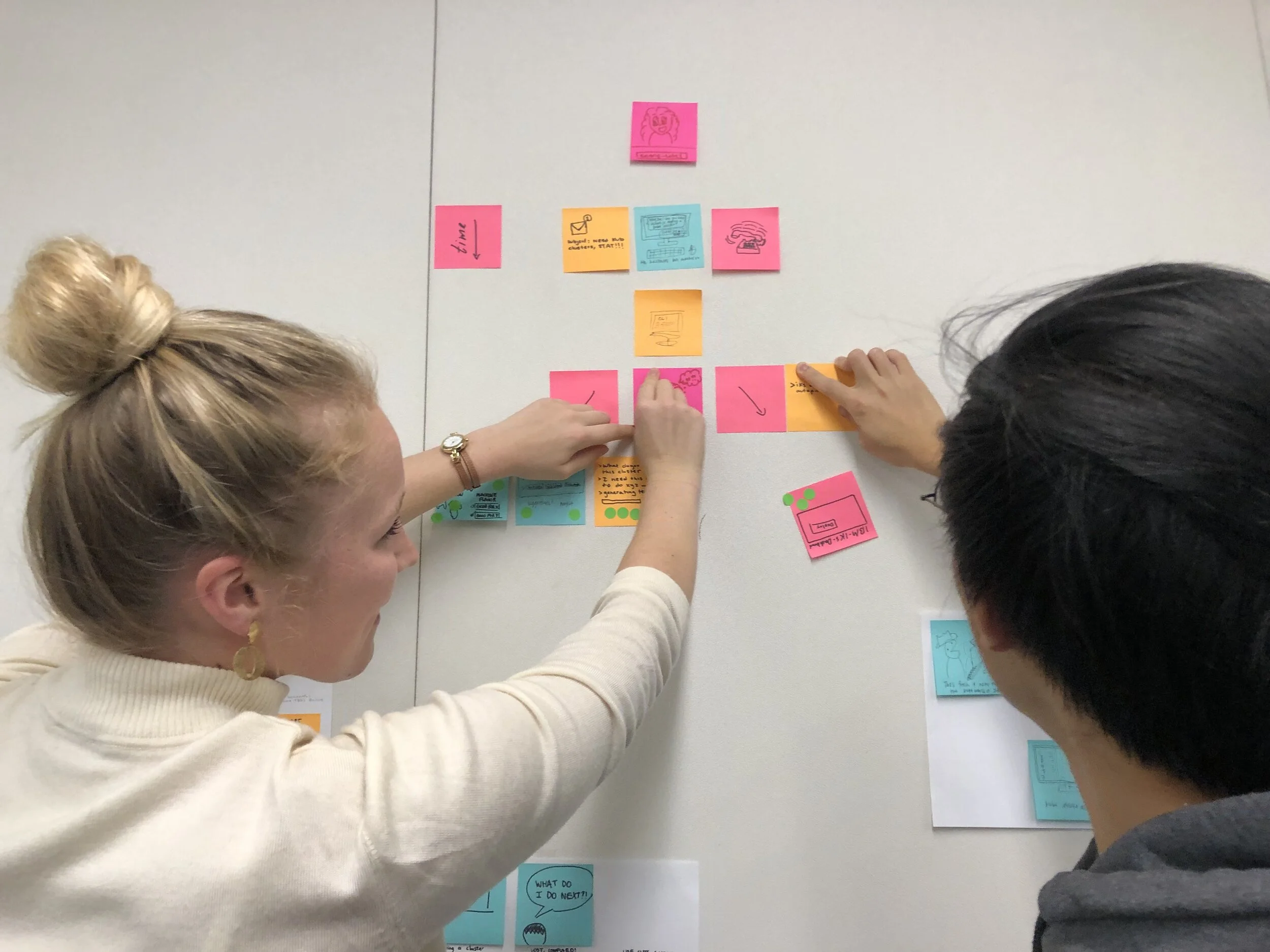
The sense-making phase allows us to group user goals and challenges into different categories of over-arching themes and insights. This leads us to the Big Ideas phase where we take these insights and translate them into solutions.
PAPER PROTOTYPES USER TESTING
In this stage, we created lo-fi prototypes made out of paper to test out with users. We asked them to use the interface by pointing to the prototype. In the end, we would ask our user “If you had a magic wand what would you change?”.
These testing sessions were often filmed, with the consent of the user in order to be evaluated and reviewed by our team. After each review, we would note painpoints throughout the interaction.
“UI usually hides the back-end and with Kubernetes you have to be in control so the CLI is reassuring.”


