My Role: UX Designer
Development and creation of the ontology, taxonomy, choreography. Navigation within the application.
ZESTY
SOLUTION STATEMENT
PROBLEM STATEMENT
To create an app meeting helping our user keep track of his recipes, discovering new ideas and developing their career.
Understand the needs of a young professional chef and prioritize them. Create an ontology, taxonomy, and choreography. Create an app that caters to his needs while using those tools.
FEATURES
Customize chef’s profile
Link other communication channels
List skills
Use Collections to gather and quickly access pins and dishes.
Post Dishes and include recipes
Find other chef’s on the account
Create lives to broadcast classes and challenge other chefs
ONTOLOGY PROCESS
1.
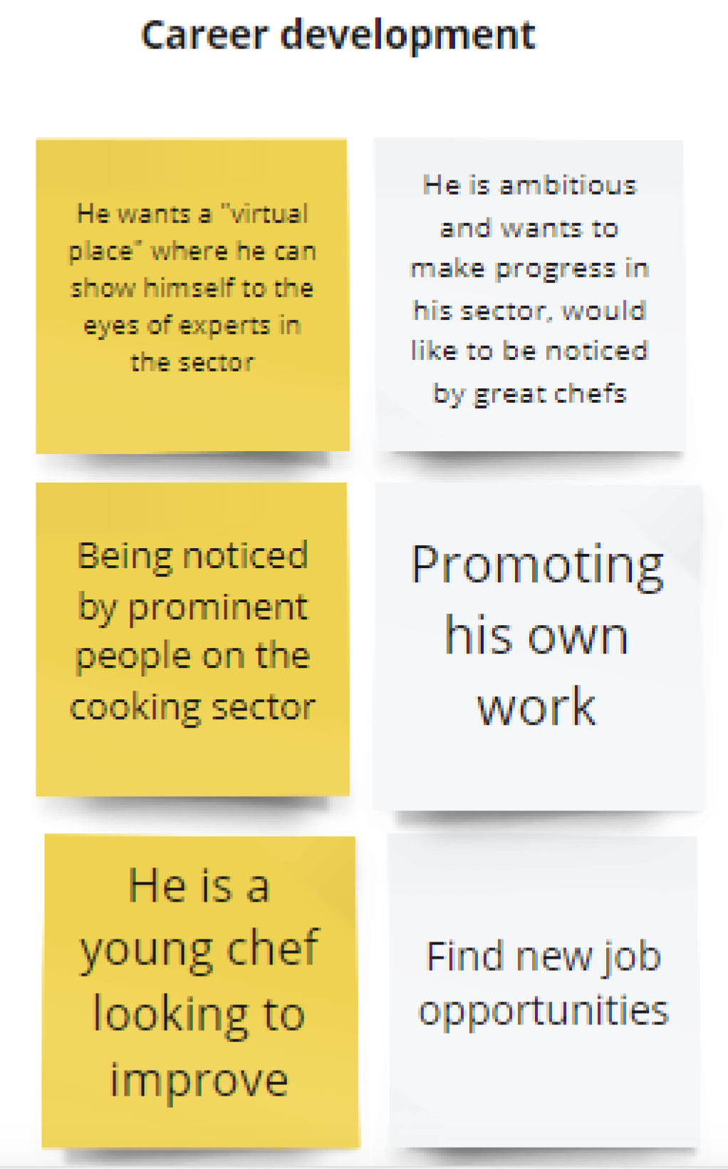
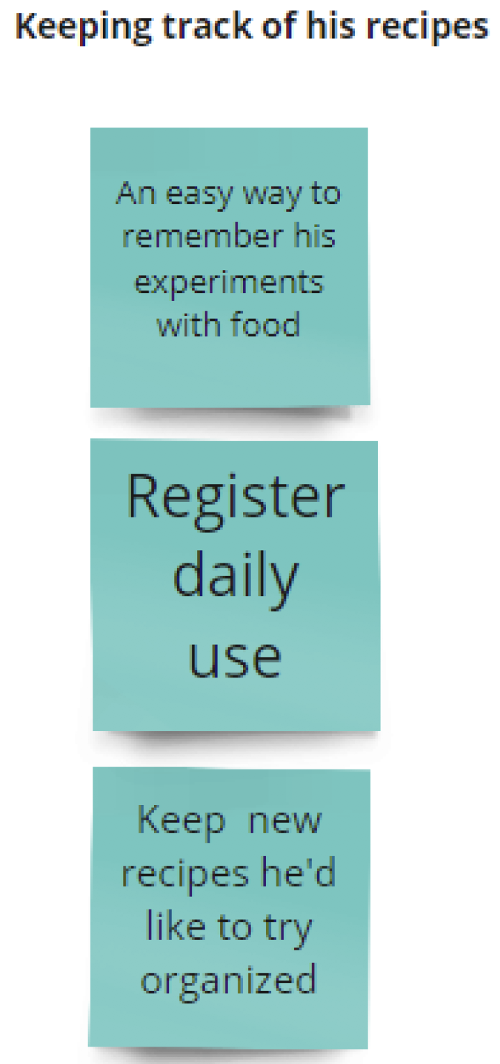
For this challenge, we were given this persona to work with. We highlighted everything we found relevant and clustered the post-its.
2.
The colored post-its refers to the insights we took directly from the text, and the white ones are assumptions we made based on them.
3.
We summarized each cluster with a sentence which became our user need.
4.
In order to start our ontology we decided to make sense of our user needs. We ranked them and focused on the top three. Along with the rank, we turned these goals into actionable items for an app.
TAXONOMY PROCESS
1.
For the chef’s profile, we chose to give a lot of diversity to the ways our users could present themselves. To allow for greater interaction, we also allow for multiple communication channels to be linked to the profile. Skills are also included to showcase the chef’s different talents.
2.
Skills are organized in an existing list, users can choose from. This allows for homogeneity throughout the site as users look for and compare skills.
3.
Collections can either be public or private depending on the user’s preference. They contain both pins and dishes the user would like quick and easy access to. Each collection has a title and displays the amount of items within it.
4.
Dishes are entered into the system by category. This allows users to find them more easily when searching for a type of dish. Ingredients are indicated as content types for all recipes to follow the same structure in the app. Skills used during the preparation are included to keep track of frequence of use and progress as well as showcasing them to other chefs.
5.
Category name allows for users to find the recipe to a particular dish more quickly or be inspired within a single category.
6.
Ingredients are organized by name, unit and quantity.
7.
We allow users to use whichever unit of measurement they want.
8.
Pins are snippets of information the user wants to keep for future reference. Images and titles are autogenerated based on the link but can be edited if needed. This allows for the user to immediately recognize the link when he needs it while cooking. Personal video or image files can also be published as a pin. For example, if the user attends a cooking class and films a portion of it, he can store the video here. If he finds a recipe in a physical recipe book, he can take a picture and store it here. This allows him to keep all these useful information in one place.
9.
Pins using external data can range from tweets from chefs to video excerpts on Youtube or user quotes on message boards. To ensure good organization, external sources will include a title and a text preview. If a video is tweeted, a video screen will appear, and clicking it will redirect the user to the page. If a tweet is pinned the tweet will appear in the “text preview.”
10.
Live streams allow for users to share tutorials with their users as they ask them questions or ask for tips. They can also be a way for users to challenge each other to cook dishes or cook a dish together. Lives can private or public. Co-host can be added to lives in users want to create together. Total viewers will be displayed.


